
Your email doesn’t need to say everything
The brands I design emails for have very little in common.
The brands I design emails for have very little in common. One sells health supplements, one sells frozen food, another sells crystal glassware. The branding is different for each, and so is the audience. But there’s one problem I see with almost all of them: they want to put every piece of information into the email.
Why brands overload their emails
I think a lot of it comes from panic. Inboxes are busy and brands want to be noticed, so the instinct is to say everything at once in case this is the only email someone opens. There’s also a gap between how a company sees itself and how its customers see it. When you’ve built a product, every detail feels important. The customer doesn’t need all of it to decide whether they’re interested.
The same instinct leads to pushing one sale after another: 20% off, then 30% off. It gets clicks for a while, but you end up with an audience that only clicks when there’s a discount. With the number of emails most brands send, you need people who open because they want to see what you’ve sent, and the design has a lot to do with that.
Why putting everything in an email lowers clicks
If the email already tells someone what the product is, how it works and what it costs, they don’t have a reason to click. They’ve had the whole story. A blog post is where you put all the information, because people go there to read it. An email is meant to get someone to go somewhere else, usually a product page, and that’s where they can read the details and buy.
So I’d rather keep emails short and leave a bit of mystery. Give people one good reason to be interested and a clear button, and let them click through for the rest. If they want to know the price or what’s included, they can find it on the site, and by then they’re already on the page where they can buy.
How to decide what goes in an email
When I push back on a brief, I’m not trying to make the email emptier. I’m trying to make it work. Everything has a home already, on the product page, the blog, the FAQ, and the email’s job is to get people there.
The brands I work with will never have much in common, and they shouldn’t. But the ones that get the best results trust their customers to click for the rest of the story. So the next time you’re writing a brief, try cutting it in half. Then ask what the one thing is that you want someone to feel or do when they see it. That’s your email. The rest can wait on the other side of the button.
How much text should go on an email banner?
Less than most briefs ask for. It usually shows up in the brief for a banner. The copy for one image will include the headline, a subheading, the product benefits, the price, the delivery details and sometimes a paragraph about the founder. I’ve had clients ask for what felt like the whole kitchen sink on one banner, and I genuinely didn’t know how they expected it to fit.
Part of the problem is technical. There’s a limit to how much text you can put on an image before it stops being readable on a phone. Heavier, image-based emails also load more slowly and are more likely to run into deliverability problems. So when a brief like that comes in, I can’t just make it look nice and hand it back. It wouldn’t work properly.
Email design examples from our team
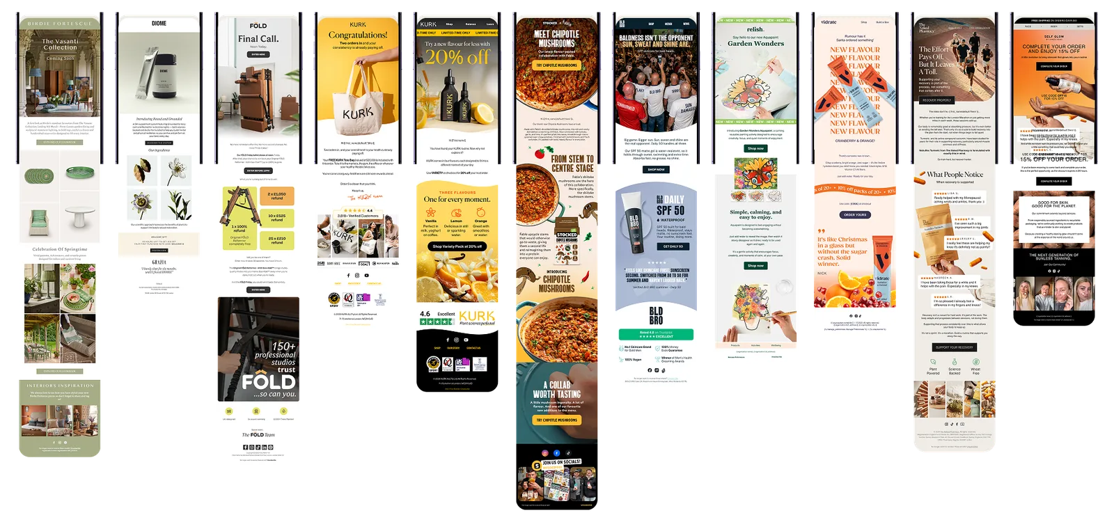
Here are some of the emails we’ve designed for Apostle clients. They’re all different brands with different looks, but each one is built around one message and a clear reason to click.
Contact